Collaboration with company
Collaboration with company
MOALI
EXPLORE
MOALI
EXPLORE
MOALI
EXPLORE
Company
Company
Moali
Explore
Moali
Explore
Function
Function
UX/UI
Designer
UX/UI
Designer
Tools
Tools
Figma
Chat GPT
Adobe Creative
Figma
Chat GPT
Adobe Creative
Figma
Chat GPT
Adobe Creative
Description
Description
In this redesign, the goal was to transform a platform with high technical and visual debt into a competitive digital product.
Problem: The brand lacked a clear visual structure, which hindered navigation and diluted the impact of its value proposition.
Solution: I restructured the information architecture and visual hierarchy to guide the user intuitively, prioritizing readability by designing a balanced visual system that eliminates unnecessary noise, allowing the content to breathe.
Before
Before

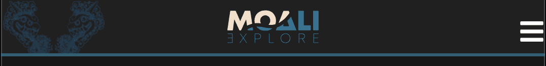
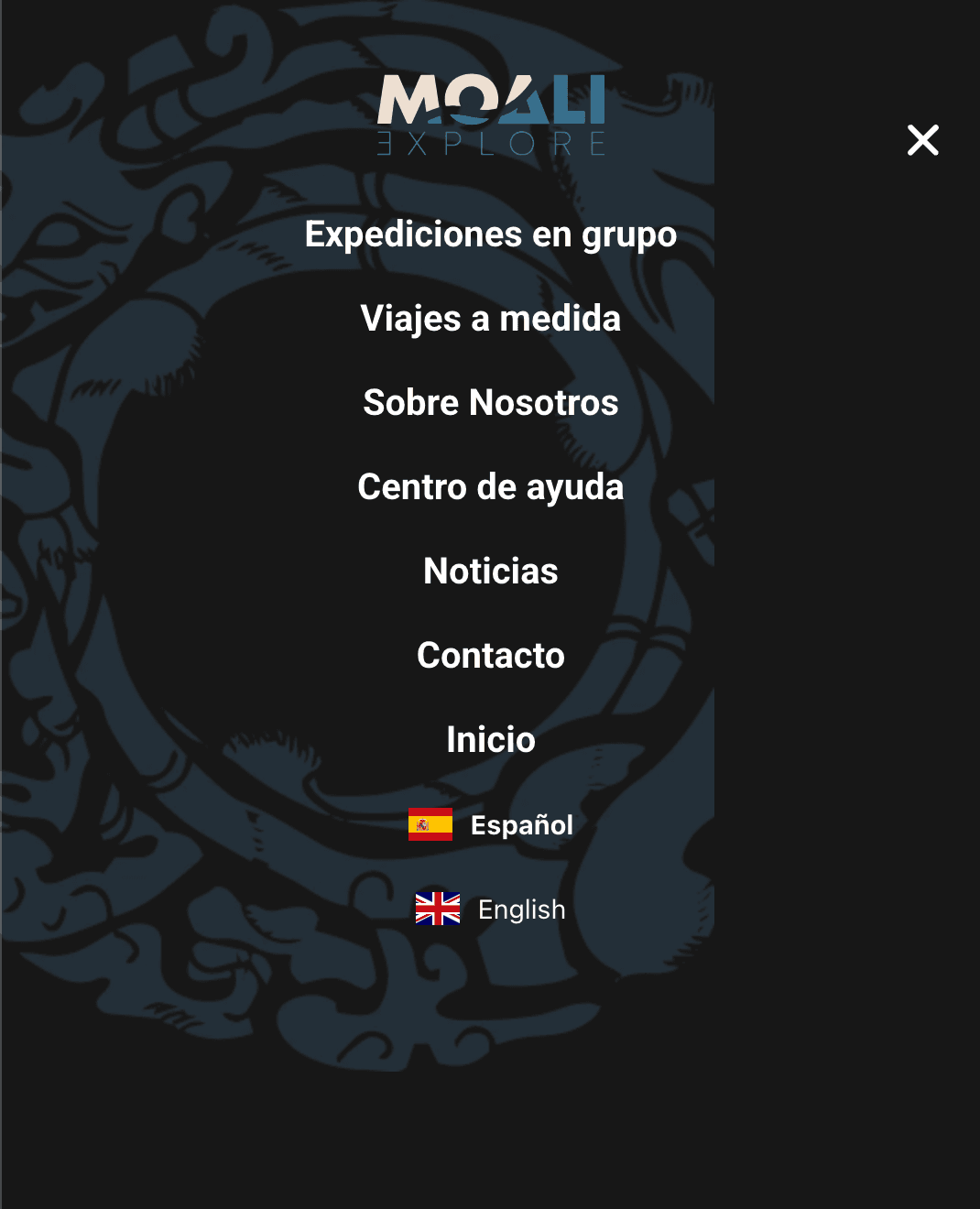
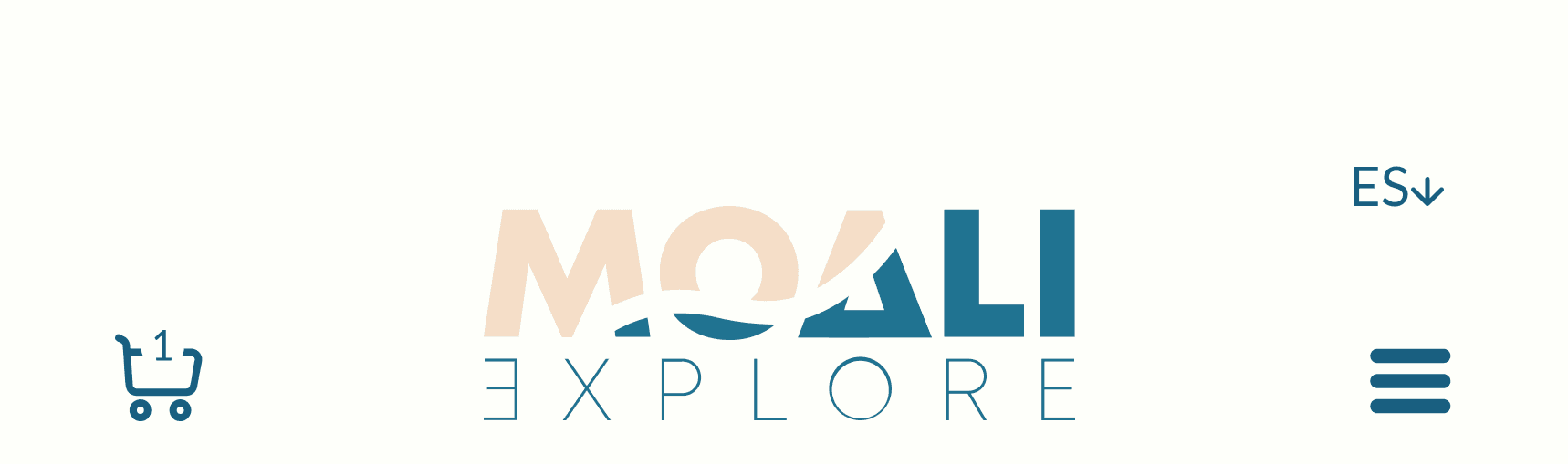
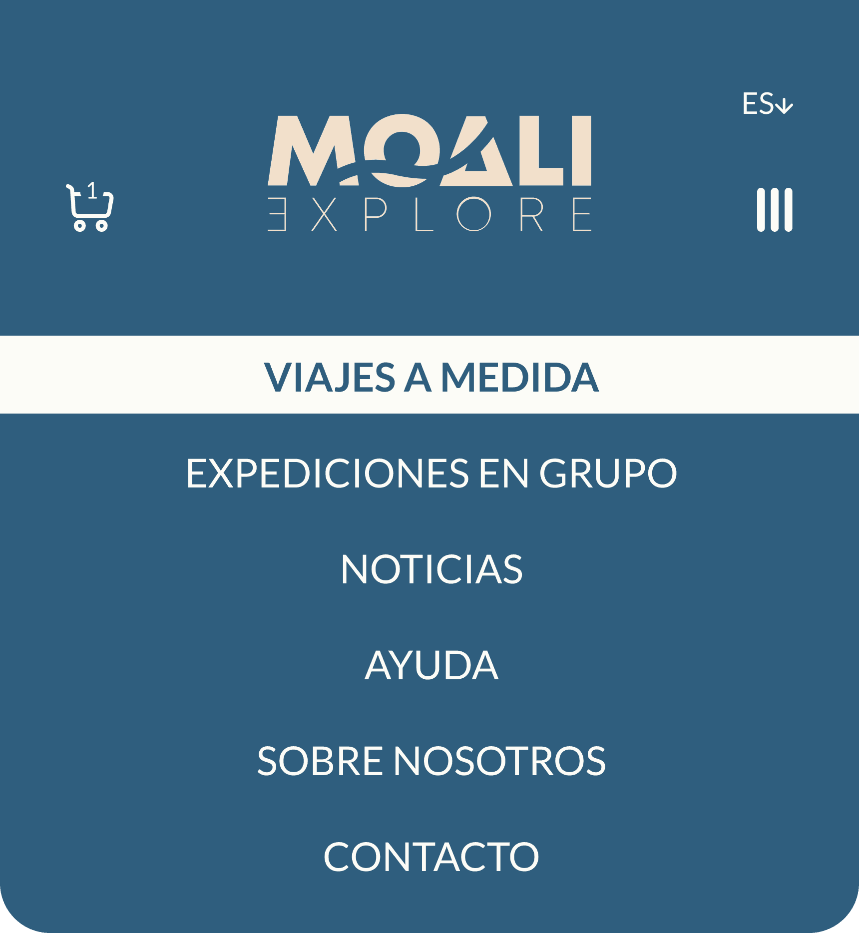
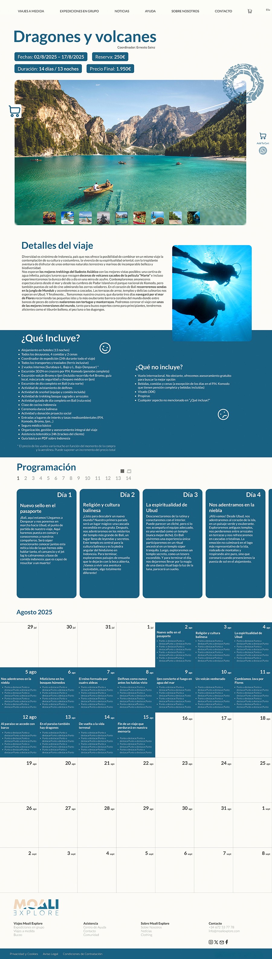
UX Focus: I implemented dynamic navigation with a sticky nav that transitions from an expanded to a compact state when scrolling, optimizing space without losing control. To reduce cognitive load, I applied the rule of 7 maximum links and simplified the language selector. Additionally, I integrated strategic fixed elements, such as the "Add to Cart" button and WhatsApp direct access (offering several versions), ensuring that conversion actions are always available. On mobile, I reinforced the contrast of the hamburger menu and added the cart for a seamless shopping experience.
UI Focus: I developed a functional minimalist aesthetic with a clean color palette that reinforces brand trust. The visual core is based on a system of dynamic components created with Auto-layout, ensuring that buttons and menus maintain perfect hierarchy and total legibility on any device, while taking care of technical details such as spacing and line height to avoid visual clipping in the typography.
After
After


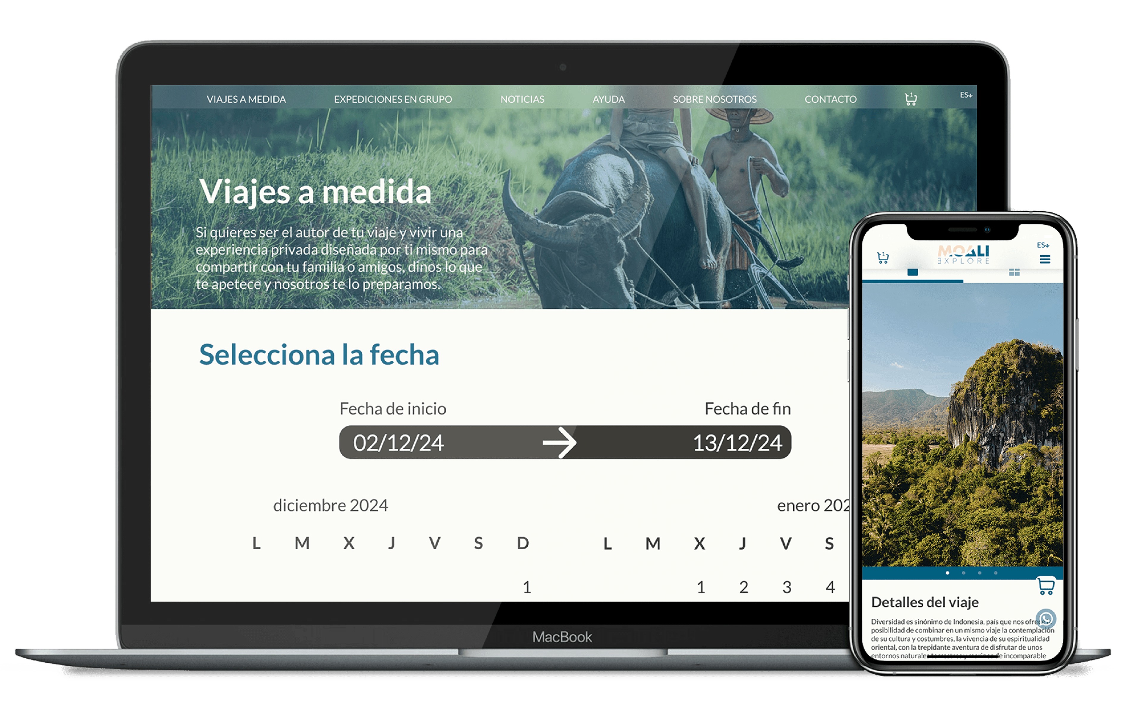
Web Version
Web Version
Desktop design focused on creating a robust system that supports large volumes of content without overwhelming the user, allowing for a seamless transition between inspiration and purchase.
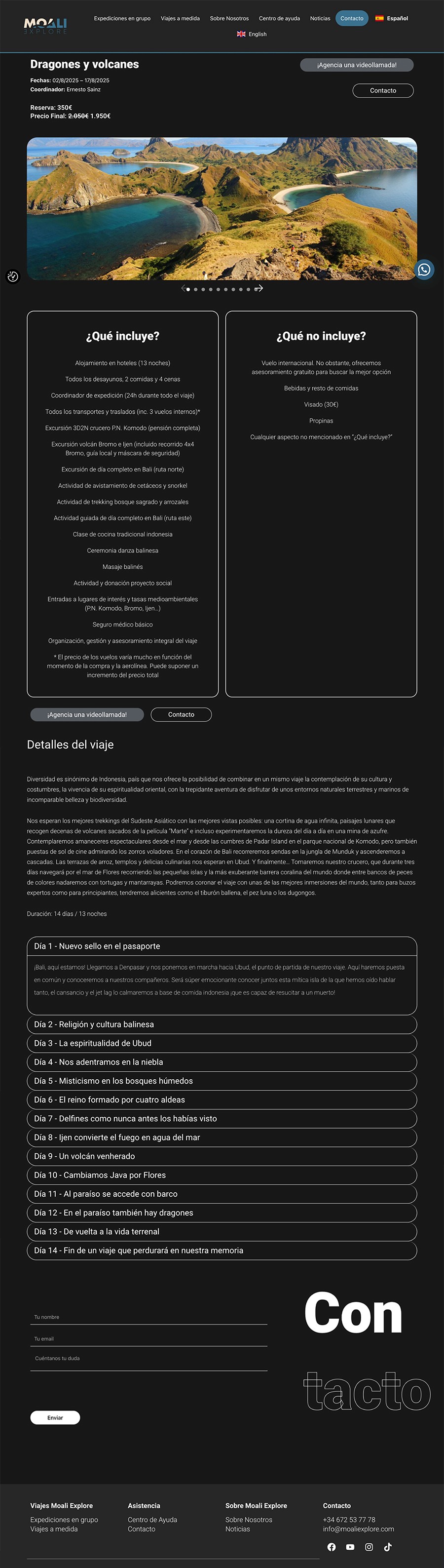
UX Focus: I implemented a content hierarchy based on scanning patterns (F-pattern), removing secondary elements to focus attention on the main destinations. I restructured critical journey information to make it highly scannable, allowing the user to instantly differentiate between what is included and what is not. Additionally, I optimized the calendar view and shopping cart access, ensuring the booking process is intuitive and always easy to locate.
UI Focus: I used precise whitespace management to visually separate different information categories. Destination cards act as atomic components, facilitating clear reading and predictable interaction through refined hover states. The visual design of the calendar and service tables was simplified to reduce noise, making the comparison of options fast and visually harmonious.
Desktop design focused on creating a robust system that supports large volumes of content without overwhelming the user, allowing for a seamless transition between inspiration and purchase.
UX Focus: I implemented a content hierarchy based on scanning patterns (F-pattern), removing secondary elements to focus attention on the main destinations. I restructured critical journey information to make it highly scannable, allowing the user to instantly differentiate between what is included and what is not. Additionally, I optimized the calendar view and shopping cart access, ensuring the booking process is intuitive and always easy to locate.
UI Focus: I used precise whitespace management to visually separate different information categories. Destination cards act as atomic components, facilitating clear reading and predictable interaction through refined hover states. The visual design of the calendar and service tables was simplified to reduce noise, making the comparison of options fast and visually harmonious.
Antes
Despues
Antes
Despues
Mobile Version
Mobile Version
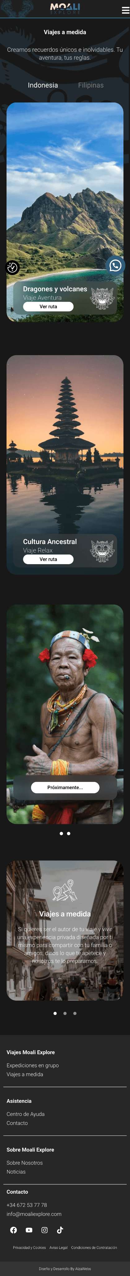
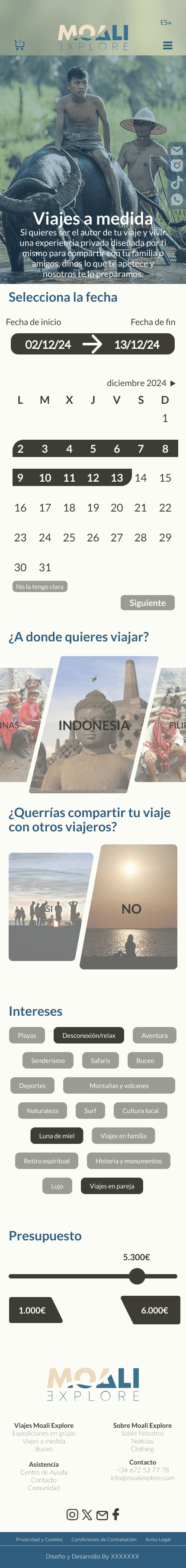
The transition to mobile devices was not a simple adaptation, but an optimization of the tactile experience.
UX Strategy: I prioritized one-handed usability by optimizing the "natural interaction zone." I adjusted touch targets to a minimum of 44x44px and simplified navigation into a more intuitive hamburger menu that includes direct cart access. To boost conversion, I implemented persistent (fixed) buttons at the bottom for critical actions like WhatsApp contact and "Add to Cart," allowing the user to move forward with their travel decision without having to scroll back up.
UI Strategy: I adapted the typography and visual elements by reinforcing contrast in navigation components to guarantee outdoor readability. The design is 100% responsive and maintains consistency through the use of dynamic components that readjust automatically. The visual system for fixed buttons and social media icons was designed to stand out without obstructing content, maintaining the brand's minimalist and clean aesthetic on smaller screens.
Befrore
Befrore
After
After
Mockups
Mockups
The final visualization phase allows observing how the design system integrates into the user's life.
UX Strategy: Validation of User Flow consistency across different devices, ensuring that the transition from web to mobile is transparent for the user.
UI Strategy: Application of the interface on high-resolution devices to verify contrast, image saturation, and the fidelity of the Design System components created specifically for this project.
BEFORE
AFTER
Madrid, Spain
+34 646 850 504
albertobll97@gmail.com
2026
Alberto Benito
BEFORE
AFTER